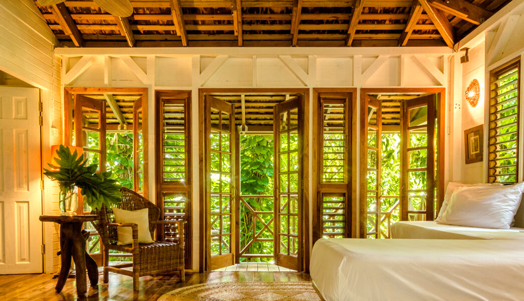
Kanopi House A collection of eco-chic treehouses nestled high amongst 100-foot Banyans and rooted deep in Jamaican culture. You’ll find us tucked along a secluded hillside overlooking the famed Blue Lagoon and surrounded by winding bamboo and ginger lily-drenched pathways. Kanopi House is the perfect escape for those in search of a little adventure and… Read More
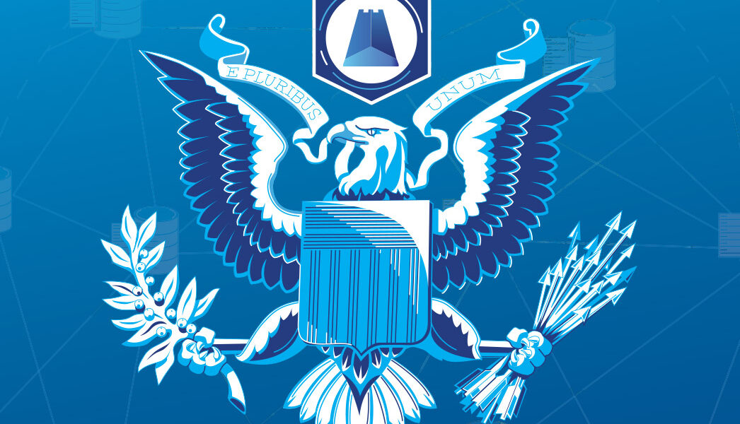
Stronghold Stronghold was a startup looking to change the way we do things in a digital age of blockchains. We build the branding and art direction up from the tower as we worked on documentation design, illustrations, UX and motion. Always presenting complex information in easily understandable bites using pictograms and iconography. Read More
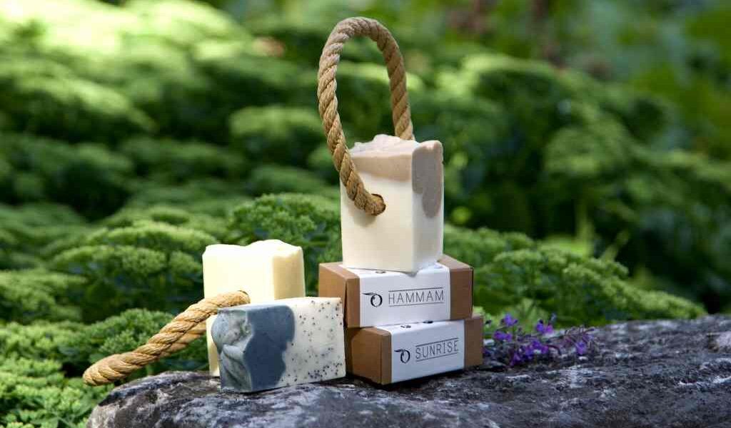
Laveos Laveos is a high end soap brand in the Netherlands whos focus is on making the most wholesome, natural soaps available on the market. Everything you need, nothing that you don't, with an olive base, it was the key feature in the logotype and icon. The pylosyphy is translated into the webshop and… Read More
Rheact ISKO took it's key fabric technology and turned it into a consumer brand. A new type of clothing that allows you to maintain your flow, while giving you the support to act. Rhea is the mythical goddess of flow, her name literally means "That which flows". Action combined with the state of rediness and… Read More
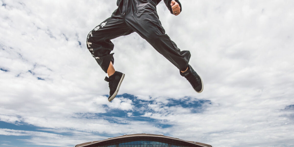
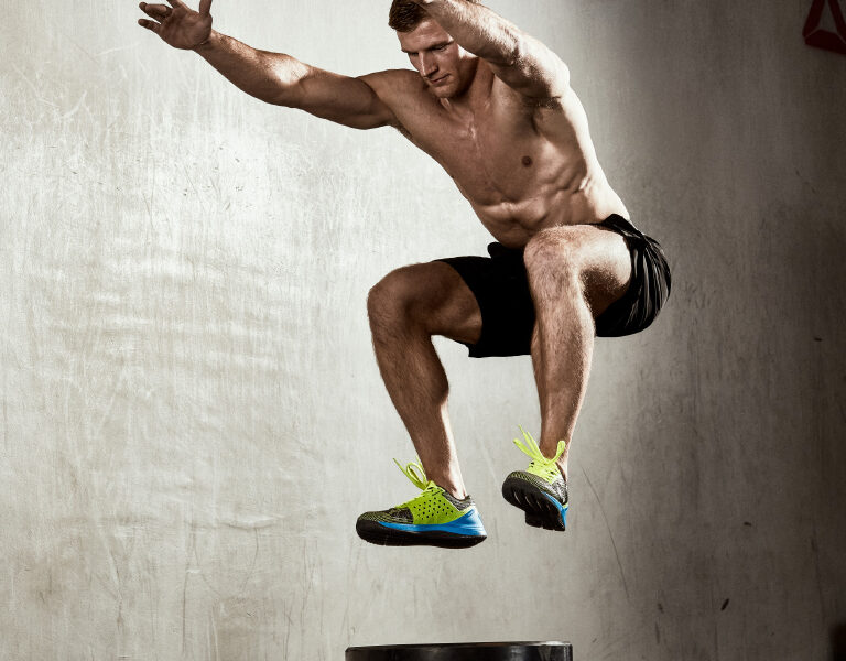
Reebok Nano 7.0 Shot on location at the official reebok crossfit 020 gym in amsterdam with their impressive trainers! The shoot was divided into 3 segments, action, portrait and product to be used for reebok's global communications to promote the customisation of the crossfit shoe. Read More
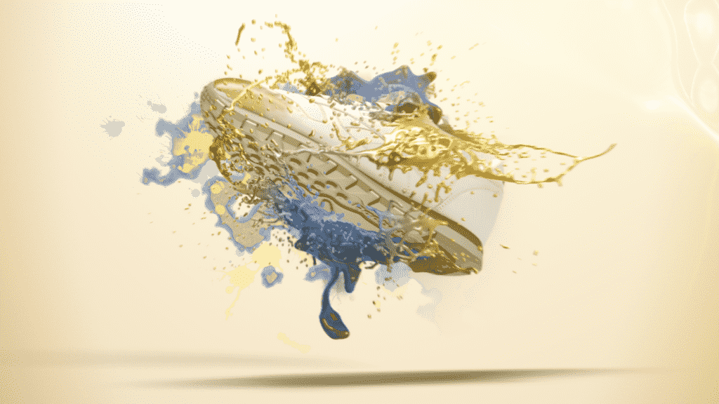
YourReebok The main direction for this project was the customization focus of the web application to design your own Reebok shoes. Each shoe has its own unique art direction that is linked to their own theme of fluid, or technical for the Nano. Each keyframe was hand drawn to ensure a streamlined process, meet deadlines… Read More
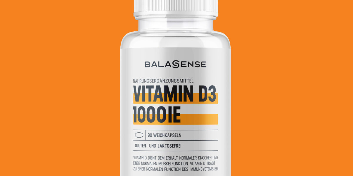
Balasense Tasked with rebranding Balasense and creating a global guidelines for their complete packaging range of supplements.The branding represents a simplistic logotype with the S composed of two bars, symbolizing balance a ying yang in contrast, along with the S resting in the absolute center. The two bars that are found in the S can… Read More
Renault loyalty system Renault needed to construct a loyalty system to be organized and designed to match their branding. Keeping with the use of yellow highlights found in their brand using the white background and space to create a balanced high contrast page. My roles were overall design and UX. Read More