Balasense
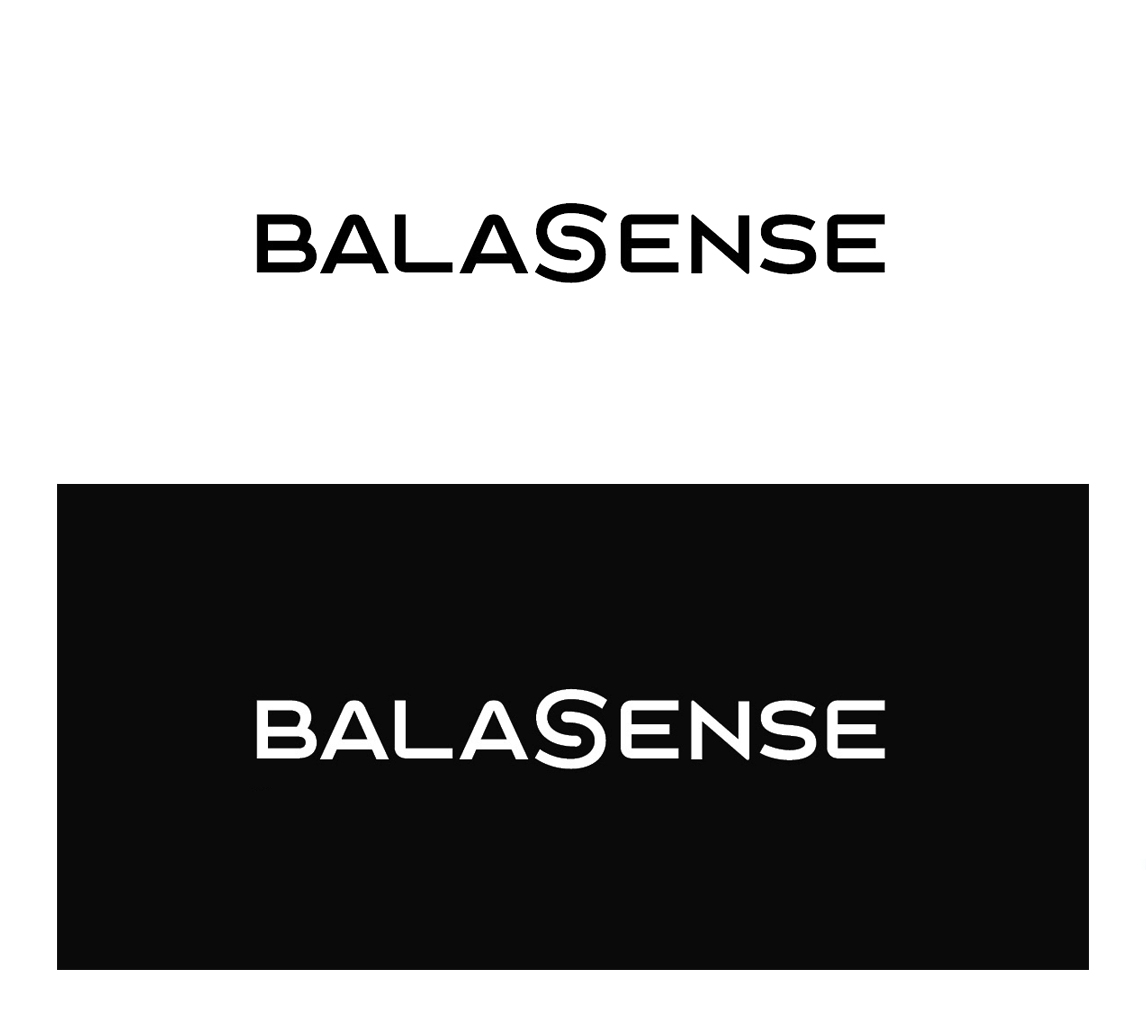
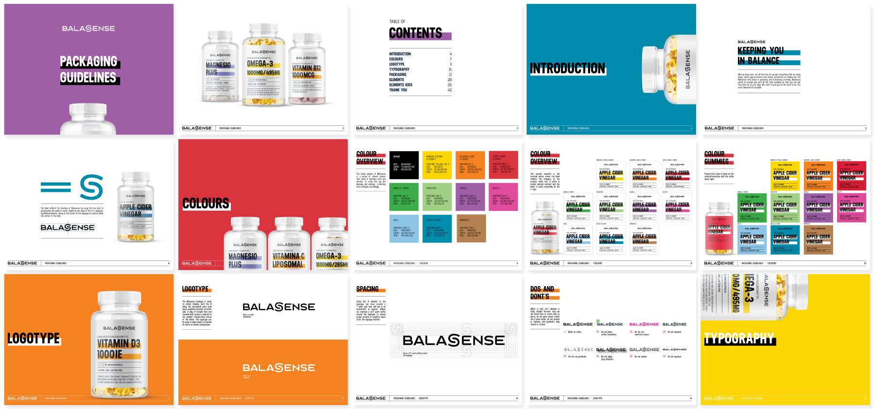
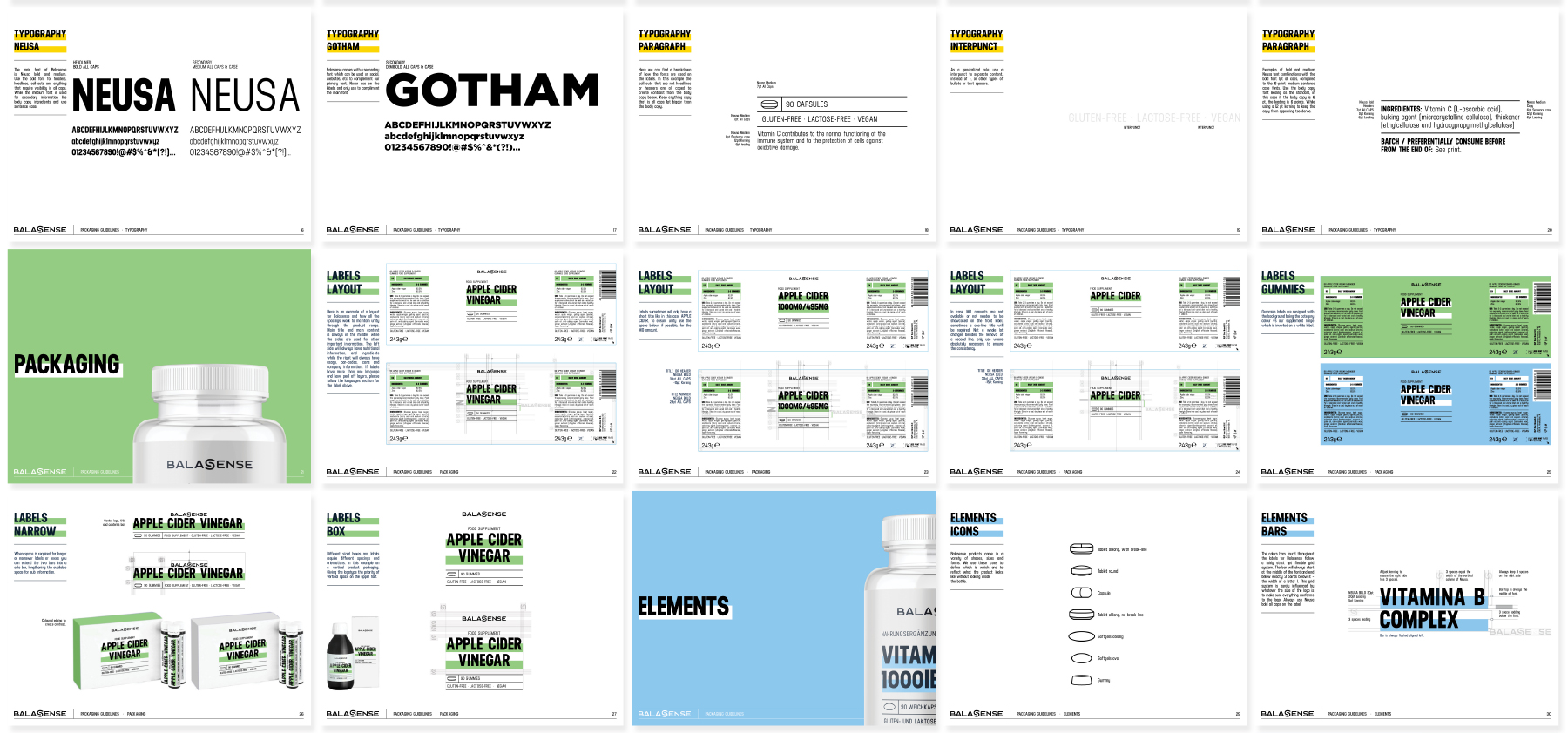
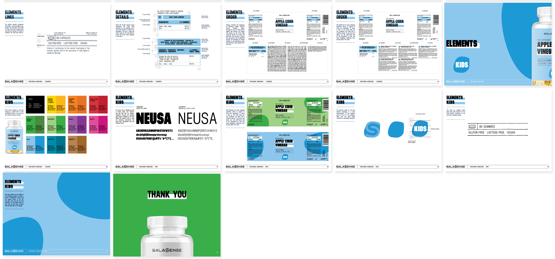
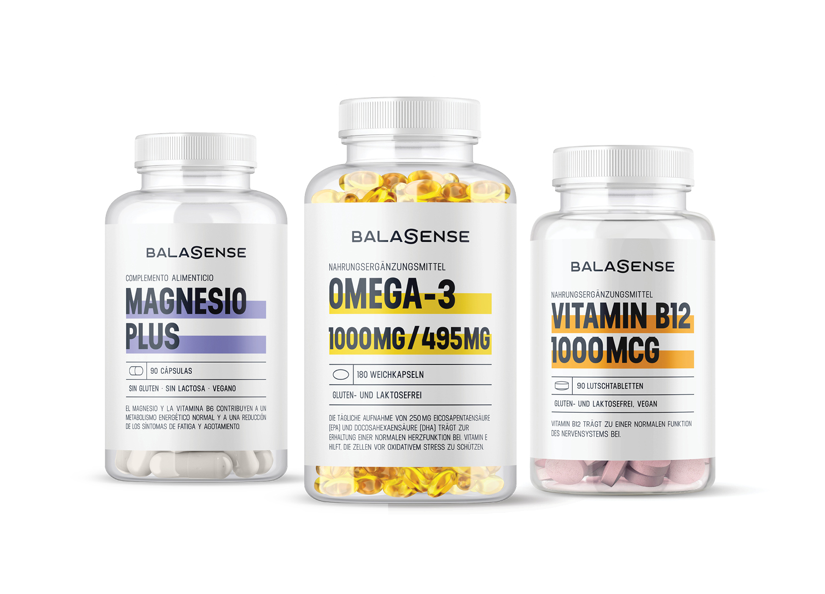
Tasked with rebranding Balasense and creating a global guidelines for their complete packaging range of supplements.The branding represents a simplistic logotype with the S composed of two bars, symbolizing balance a ying yang in contrast, along with the S resting in the absolute center. The two bars that are found in the S can be found as a major design element throughout the packaging art direction, fusing the two together. Bold colours indicate the various categories of the Balasense product range in the bars, while solid colours backgrounds represent gummies and kid products.


